Choosing the right colour for your blinds can make a big difference to how a room looks and feels. It’s not just about style as colour also affects light, space, and how comfortable a room is throughout the day.
If you’re deciding between different shades or finishes, these simple tips can help you choose colours that work well in your home.
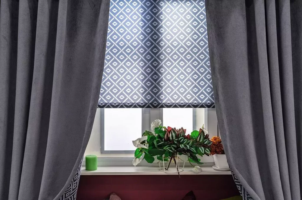
Lighter shades are a reliable choice for rooms where you want a bright and open feel. Colours like white, cream, and soft pastels reflect more natural light, which helps make a room feel larger and less enclosed. This works particularly well in living rooms, kitchens, and dining areas.
Lighter blinds can also reduce the contrast between the window and the wall, creating a more seamless look. If your space gets a lot of sunlight, lighter fabrics such as sunscreen blinds can help soften glare without darkening the room.
Darker or more saturated colours can add depth and contrast, especially in modern or more defined interiors. You can approach this in two ways:
Bold colours tend to work best when the rest of the room is relatively simple. Too many strong colours in one space can make it feel busy.
Colour can change depending on how much natural light a room receives. In bright rooms, colours may appear lighter or slightly faded while in darker rooms, the same colour can look deeper or more muted. Therefore, it’s worth thinking about which direction your windows face and how the light changes throughout the day. A colour that looks good in the morning might feel different in the afternoon.
This is especially important when choosing between light-filtering blinds and blackout fabrics.
Colour choice isn’t just about appearance—it should also match how the room is used. Bedrooms often suit darker or neutral tones paired with blackout materials, while living areas usually benefit from lighter tones that keep the space feeling open. On the other hand, bathrooms and kitchens may require moisture-resistant materials, where colour options can vary depending on the finish.
If you’re choosing blinds for larger openings or doors, it may also help to explore vertical blinds Auckland, which offer similar flexibility in a wider format.
Keeping your colour palette simple can make your home feel more balanced. A common approach is to choose one main colour and add one or two complementary tones. This helps avoid a cluttered look, especially in smaller spaces.
If you prefer consistency, you can use similar colours throughout the home, adjusting slightly from room to room. This creates a more connected overall design without making every space look identical.
Colour and placement can influence how large or small a room feels. Lighter colours can make a room feel more open, while darker colours can create a more enclosed and cosy feel. In smaller rooms, using light-coloured blinds that fit neatly within the window frame, such as recessed roller blinds, can help maximise the sense of space.
Before making a final decision, consider how the colour works with your wall and flooring tones, whether the blind will blend in or stand out, how much natural light the room receives, and how often the space is used. Taking a bit of time to compare options can make a noticeable difference to the final result.
Choosing the right blind colour doesn’t have to be complicated. By thinking about light, room function, and overall style, you can find a colour that works well both visually and practically.
If you’re exploring different options, you can browse our roller blinds Auckland and custom blinds Auckland to find colours and finishes that suit your space.